
Planning a space, especially a large commercial space, can be a very daunting task. Have you ever walked into a space and the second you arrived you wanted to turn around and walk right back out of it? Maybe, you couldn’t put your finger on just exactly what affected you. Most likely, it had something to do with color or a color combination. Color is a key element for creating an attractive commercial space. Color psychology, specifically commercial color psychology, is a theory that’s driven mostly by practical concern. Our own personal feelings about color are deeply rooted and therefore, we assume the same for others. Although there’s little empirical work conducted, there are current studies that show there exist universal feelings about each color. These feelings vary from culture to culture and so we think our environment influences how we feel about hue. Here are some helpful tips on understanding how color may affect you, your employees and your clients.
Set the Mood with Color

When surveyed, we universally agree that when subjected to certain hues, we feel certain feelings. Sometimes, we will say that color takes on the same meaning as the feeling it evokes or the mood it sets. For instance, yellow makes us feel happy, so yellow has a meaning of optimism or happiness. In the chart above we give examples of what type of business might be more likely to use each color based on their symbolic meanings.
Neutral Colors, Finishes and Patterns
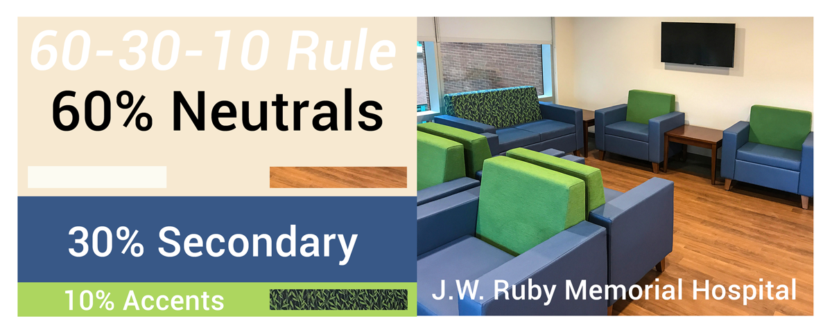
Neutral Colors should generally take up 60% of your space (because they tend to be passive), while 30% of the space can be a secondary hue and the remaining 10% should consist of accent colors or patterns that contain your secondary and accent colors (60-30-10 Rule).
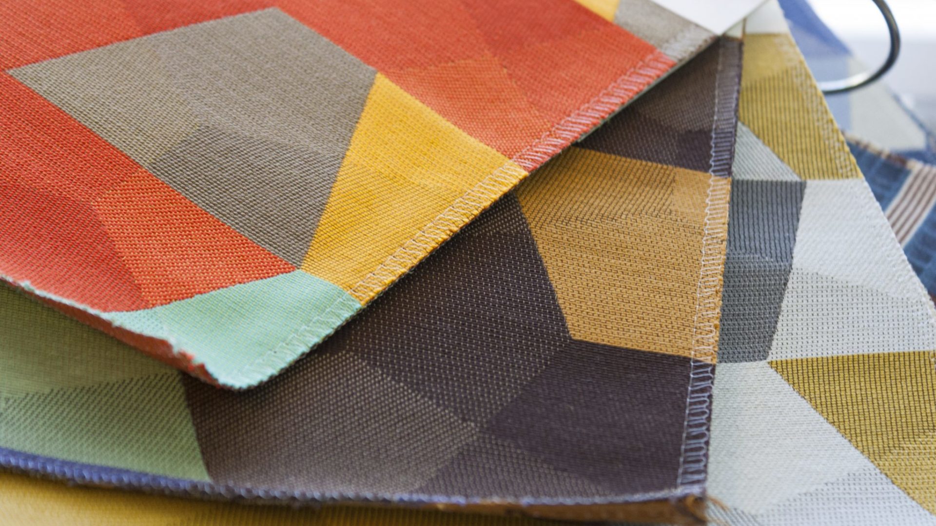
Finishes can either balance a space or give the space contrast. A contrasting finish or a lively pattern can help break up the monotonous solids. Patterns can add rhythm to a space assisting your eyes to keep traveling around the room. Contrasting wood finishes can serve their purpose as a focal point in the space as well.
Good Practices

It’s good practice to make sure all permanent items in your space have neutral colors. However, in the space pictured above, can you see how this practice does not apply and why? Secondary Colors, like blue, are good on accent walls (pictured above) and furniture (pictured below). Above, the designer still applied the 60-30-10 rule by simply applying neutral colors to the furniture, pattern and rug. See how the pattern has a rhythm as well as it’s successful in breaking up the monotony of the solid colors?

In the last example, neutrals are used on permanent items and the secondary color has been extended as part of the accent pattern in the cushions and in the artwork. It’s also good practice to use strong accent colors (for example, yellow) only on replaceable items such as artwork, cushions or pillows, glassware and rugs. Hospital waiting rooms are likely to incorporate blues based on its symbolic meaning of comfort and serenity. Do you think blue has the power to comfort a person waiting?
The seating pictured above are Pose, Villa and Enjoy lines from Kimball. Omega Commercial Interiors is proud to be a Kimball Select Dealer. Contact us for more assistance on color and space planning.